Compass is an AT&T enterprise application used by over 3,000 Managers to oversee and support over 50,000 Field Technicians in real time. As the Compass Product Design Lead on AT&T's RAPID team, I owned core flows, built the design system, partnered with engineering on Storybook, established quality control frameworks, and mentored designers to elevate the team's output. As a result, NPS more than doubled, support tickets dropped roughly 25%, and design excellence became the team's default.

Challenge
When I joined, Compass was in beta and moving fast, but the foundations hadn't kept pace with the product. There was no component library, no shared quality standards, and no definition of done beyond ticket acceptance criteria.
Designers were building screens independently without a system to ensure consistency, and design defects were making it into production. The team was operating reactively, spending sprint cycles addressing issues that could have been caught earlier in the process.
Solution
Rather than redesigning individual screens, I focused on the root causes. The product didn't need better pixels. It needed better systems, standards, and culture. I set four objectives: build a design system with engineering parity in Storybook, create a shared definition of done that included design quality, establish regular critique and coaching practices, and shift the team mindset from firefighting to proactive, research-informed design.
Approach
I started by listening. I reviewed NPS comments, support tickets, and product analytics to understand where the biggest pain points were, then interviewed Field Managers and partnered with the product team to understand business objectives and technical constraints.
From there, I built the RAPID Design System and worked directly with engineering to implement it in Storybook, creating a single source of truth for both teams. I established quality frameworks, accessibility standards, and engineering handoff criteria to close the gap between what was designed and what was built.
I introduced weekly critiques, office hours, and design sprints to give the team structure and regular feedback loops. And I coached designers on system-thinking, AutoLayout, and component-driven design to build long-term capability that would outlast any single project.
Outcome
The changes compounded over two and a half years. NPS more than doubled, support tickets dropped roughly 25%, and design defects decreased significantly. The design system became the team's default way of working, and the gap between design and engineering narrowed through the Storybook partnership.
Beyond the metrics, the most lasting impact was cultural. Designers began catching quality issues before critique, not after release. They started thinking in systems, not screens. The frameworks, standards, and rituals I put in place gave the team a shared definition of excellence that sustained beyond any single sprint or feature.
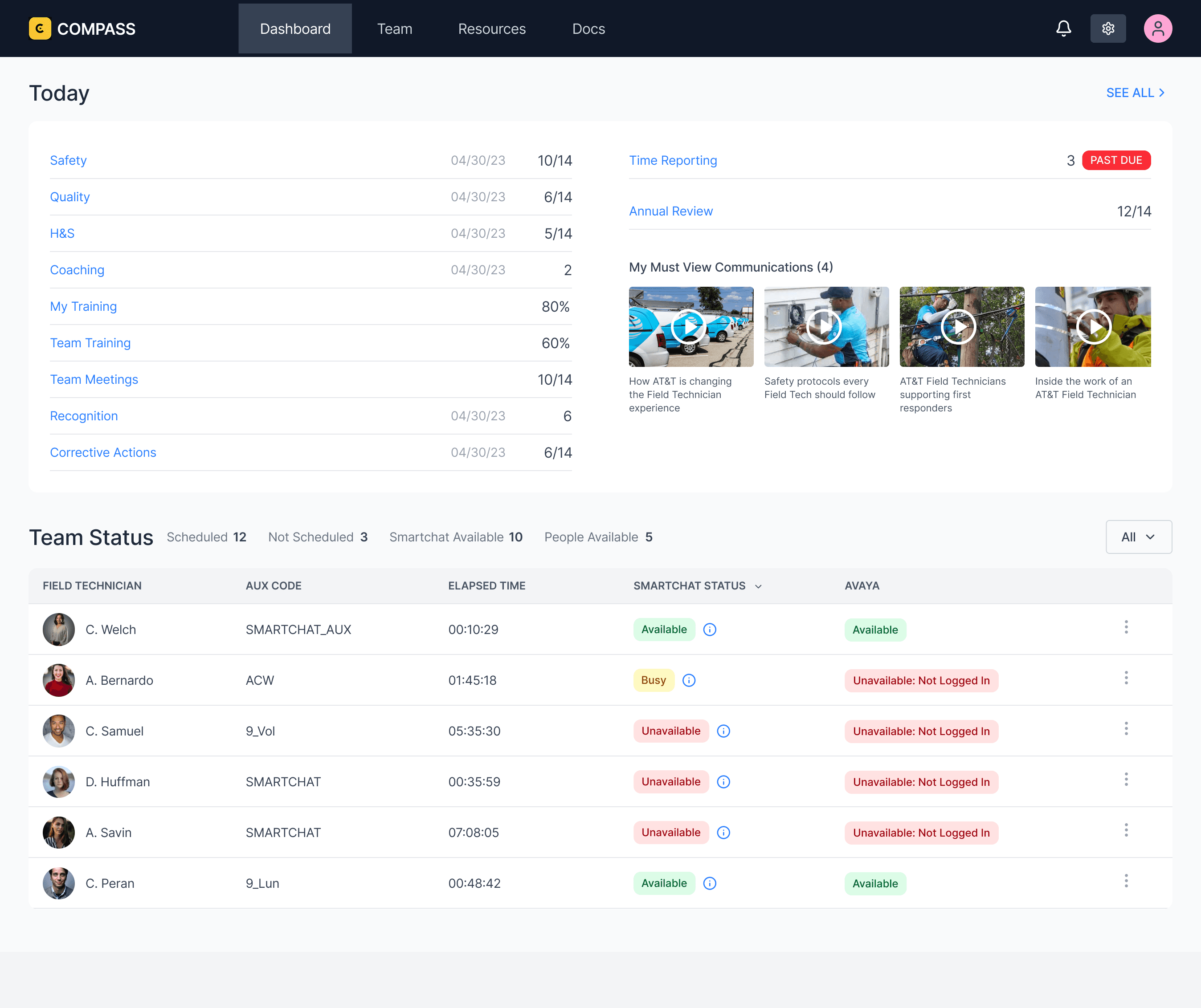
The Dashboard is the Field Manager's daily command center. It surfaces everything that needs attention today: safety compliance, quality scores, health and safety, coaching sessions, training completion, team meetings, recognition, and corrective actions. Each item includes a progress indicator so managers can see at a glance where they stand against targets without clicking into anything.
On the right, the dashboard flags time-sensitive items like past-due time reporting and upcoming annual reviews. Below that, "My Must View Communications" pushes required company content directly to the manager, ensuring critical updates don't get buried in email.
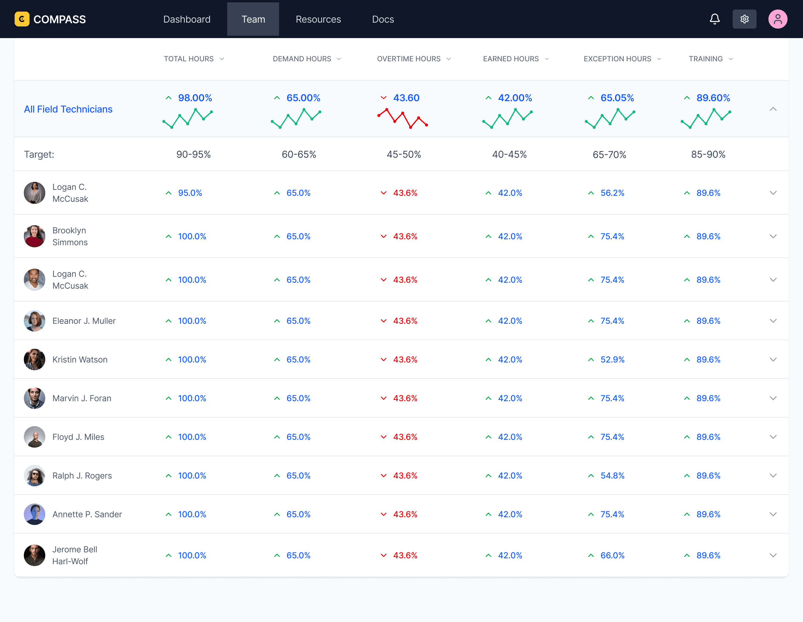
The Performance view shifts from real-time operations to trends. It gives Field Managers a clear picture of how each technician is performing across key metrics including efficiency, productivity, and utilization. Together, these metrics cover the full spectrum of technician performance across all operational activities.
The top row displays team-wide averages with sparkline trend lines so managers can quickly see whether the team is improving or declining over time. Directly below, a target row shows the expected range for each metric, giving managers an instant comparison between actual performance and organizational goals.

The Time Management screen is a drill-down into technician hours. It breaks time into categories so managers can see how hours are being allocated across their team. The bar chart on the left gives managers the overall picture at a glance, with volume and percentage labels so the distribution is immediately clear.
The horizontal bar chart in the center breaks the same data down by individual technician. Each row shows a single employee's time distribution across all categories, making it easy to compare how hours are being spent. Managers can quickly spot imbalances, like one technician carrying a disproportionate share of work while another is underutilized.
Over two and a half years, the changes compounded. NPS more than doubled, support tickets dropped roughly 25%, and design defects decreased significantly across the product. The design system became the team's default way of working, consistency improved across every screen and flow, and the gap between what was designed and what was built narrowed through the Storybook partnership and engineering handoff criteria.
Beyond the metrics, the most lasting impact was cultural. The team shifted from reactive to proactive. Designers began catching quality issues before critique, not after release. They started thinking in systems, not screens. Weekly critiques became a space where people wanted to share work, not a process they endured. The frameworks, standards, and rituals I put in place gave the team a shared definition of excellence that sustained beyond any single project, sprint, or feature.


© [UX Kitt]